6 Tactics Ecommerce Businesses can Learn from Airbnb's Marketing Strategy: Part II
"The world thought we were crazy," recalls Joe Gebbia, Airbnb's co-Founder.
In a pre-Uber era, where a sharing economy was totally unheard of, the idea of people paying to stay in somebody's home seemed absurd. But both Brian Chesky and Joe Gebbia were so passionate about their business idea that they bootstrapped their company and scaled it to a market value of $100B by 2022!
In our previous blog, we highlighted 6 of Airbnb's successful marketing tactics and how eCommerce businesses could take a leaf out of their book.
As a follow-up, this short post covers brands using the tactics mentioned earlier and, more importantly, finding success with them. Read on!
1: Open listings in a new tab
I was shopping on Forever21 when I noticed this - their product listings open in a new tab on every click. This made it easy for me to return to products shown in the previous tab and browse more when I didn't like the product I initially clicked on.
P.S: I ended up buying the 4th pink top on that list.
2: Prompt users to add important data
Navigating a store can be tricky, and your customers need to find products that easily serve their preferences. Use filters to show products your customers want to purchase - no size restrictions, no last-moment unavailability, and no overpriced surprises. This can only mean higher sales. Win-win!
Here's what U.S. Polo Assn has on their website.
3: Create scarcity with clever promotions
You use microcopy such as "Only 6 left," "4 sold in the last 2 hours," or "selling fast" just below the product image. The result? Increased impulse purchases!
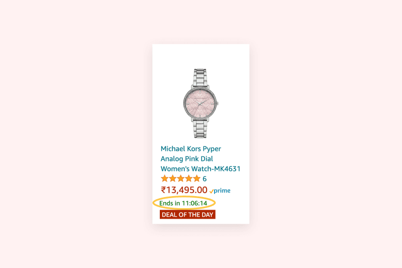
Show customers that the product they like is in demand. Countdown timers, like in the screenshot from Fossil's e-store, encourage customers to purchase before the timer runs out.
4: Highlight your hero features
Appeal to your customer's senses by giving them an image of what the product feels like on use and how it fits into their daily lives. A detailed product description highlighting the product features helps your customers understand what they are buying.
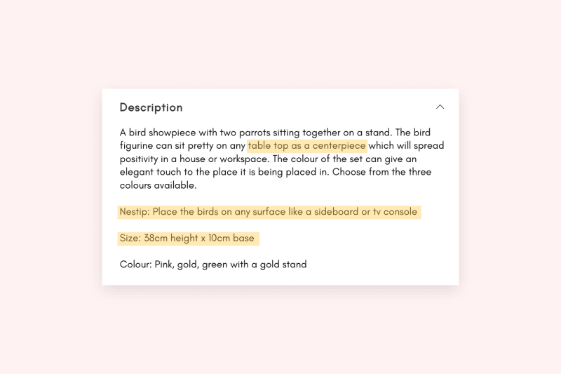
Here's a product description by Nestasia:
The description here covers the nitty-gritty details of the product like size and color. A special tip, Nestip, suggests how the product can be displayed at home.
5: Set up smart defaults to reduce friction
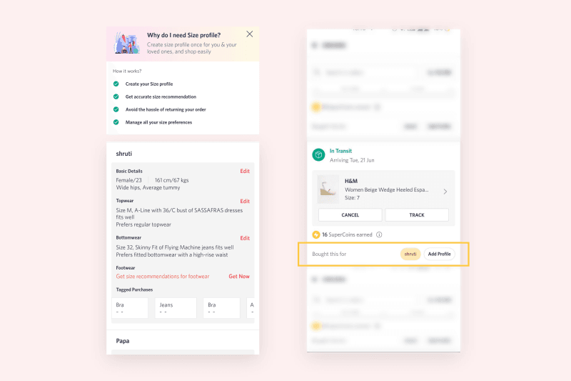
I love what Myntra has done - it lets the users create an avatar for themselves on the app. This avatar saves the preferred sizes, and Myntra automatically shows the products that fit this avatar, making it easy to shop for themselves or their family members.
6: Answer questions and address fears
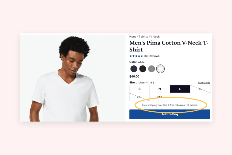
Customers are more likely to buy products from your store when you can guarantee support if things go wrong (a wrong product delivered or late delivery, perhaps?). Prompts like "30-day return policy" and "Refundable in case of physical damage" can help level your customer's confidence in buying from you.
Bombas builds trust with their shoppers by mentioning "Free shipping over $50 & free returns on all orders."
These, and a hundred other tactics apart, if an eCommerce store can step into the shopper's shoes and see the store through their eyes, see their pain points and understand what they are feeling, half the battle is won.
Do you think applying similar tactics in your eCommerce store can spell success for you?
Which one of those tips are you going to implement first?
If you cannot decide for yourself, shoot an email to hello@coderapper.com.
Our eCommerce experts at CodeRapper work with eCommerce stores across the globe to help them with different kinds of projects— from site audits to custom design to platform development to marketing.


