Accessible Shopify Implementation for a Global Record Label: Technical Learnings and Challenges
Introduction
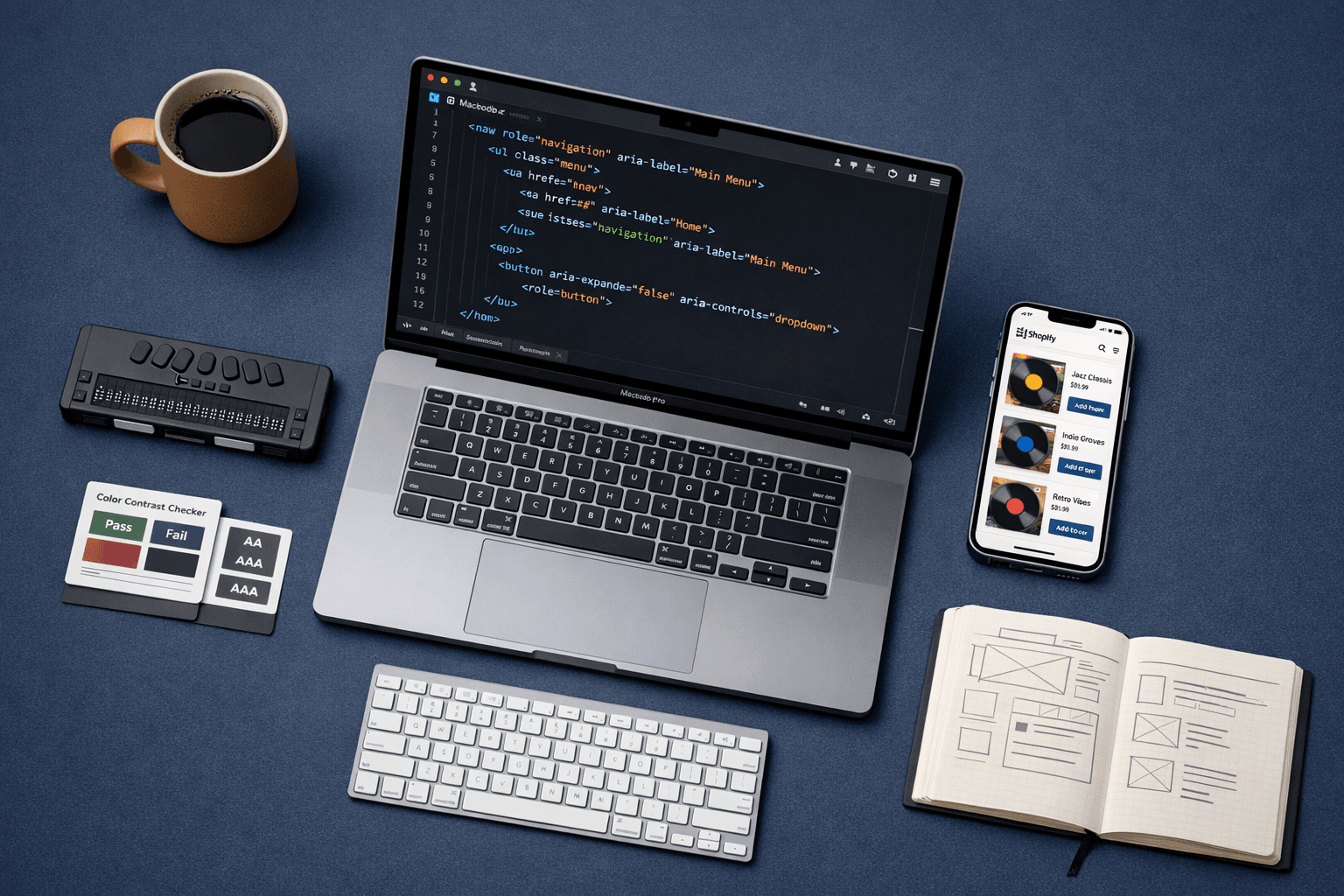
Building accessible digital experiences is no longer optional—it's a fundamental requirement for creating inclusive, user-friendly online stores. In this project, I worked as a Shopify Developer, focusing on implementing and refining accessibility features within a custom Shopify storefront for a leading entertainment brand. Using a combination of Liquid, JavaScript, ARIA attributes, semantic HTML, Shopify Online Store 2.0 features, and accessibility testing tools, the goal was to ensure that every user, including those with disabilities, could navigate and interact with the site seamlessly.
The core challenge of this project was to enhance accessibility within a custom Shopify theme, ensuring alignment with WCAG guidelines while maintaining performance, branding consistency, and compatibility with Shopify Online Store 2.0 standards. The goal was to solve issues such as non-semantic markup, missing ARIA roles, poor keyboard navigation, low-contrast UI elements, and dynamically loaded components that were not screen-reader friendly.
Additionally, we needed to ensure that accessibility improvements did not introduce layout shifts, slow down page rendering, or conflict with third-party apps embedded in the storefront.
Challenge 1: Ensuring Accessible Navigation Across Dynamic Shopify Theme Sections
One of the most significant accessibility challenges in this project was ensuring consistent and fully accessible navigation across all theme sections—particularly in dynamically rendered components like the header menu, mega-menu, drawer navigation, and app-injected elements. Many of these components load or render conditionally based on viewport size (mobile vs. desktop), making it difficult for screen readers and keyboard users to access them reliably.
Problems identified during accessibility testing included:
- Missing or incorrect semantic roles for navigation containers
- Keyboard traps when drawers or popups opened
- Incorrect focus order and missing focus states
- Dynamically inserted HTML without proper ARIA attributes
- Screen readers not announcing expanded/collapsed states
Since these components were deeply tied to the theme's Liquid structure and JS-driven interactivity, fixing them required a hybrid approach across Liquid, JS, and HTML semantics.
Approach & Solution
1. Enhancing Semantic Structure Using Liquid
The first step was to ensure that all navigation elements had proper semantic roles. In Shopify, menus often come from header.liquid and dynamic navigation snippets that vary based on the design.
I structured key navigation elements using Liquid conditionals:
    {% for link in linklists.main-menu.links %}

        {{ link.title }}

    {% endfor %}
This ensured a clear, accessible hierarchy for screen readers regardless of menu type.
2. Managing ARIA States for Dropdowns & Drawers
Drop-down menus and drawers were the major sources of accessibility failures. I implemented ARIA-expanded attributes that update dynamically:
const toggleBtn = document.querySelector('[data-menu-toggle]');
toggleBtn.addEventListener('click', () => {
  const expanded = toggleBtn.getAttribute('aria-expanded') === 'true';
  toggleBtn.setAttribute('aria-expanded', !expanded);
});
I also mapped ARIA roles to sub-menus:
Categories
By syncing ARIA states with JS interactions, both screen readers and keyboard users received correct contextual information.
3. Keyboard Navigation & Focus Management
When drawers opened, the focus previously remained behind the overlay, causing confusion for users relying on keyboard or assistive technology. To fix this, I implemented controlled focus trapping:
function trapFocus(container) {
  const focusable = container.querySelectorAll('a, button, [tabindex="0"]');
  let index = 0;
  container.addEventListener('keydown', (e) => {
    if (e.key === 'Tab') {
      e.preventDefault();
      index = (index + (e.shiftKey ? -1 : 1) + focusable.length) % focusable.length;
      focusable[index].focus();
    }
  });
}
Focus is placed on the first interactive element when the drawer opens and returned to the trigger button upon closing.
4. Handling Dynamic Sections & App-Injected Elements
Shopify apps often inject HTML that lacks ARIA or semantic structure. Because modifying app code wasn't an option, I implemented a MutationObserver to catch new DOM nodes and enhance them:
const observer = new MutationObserver((mutations) => {
  mutations.forEach((m) => {
    m.addedNodes.forEach((node) => {
      if (node.classList?.contains('app-block')) {
        node.setAttribute('role', 'complementary');
      }
    });
  });
});
observer.observe(document.body, { childList: true, subtree: true });
This ensured that even dynamically injected elements adhered to accessibility rules.
Why This Approach Was Chosen
- Theme-level control: Since accessibility work was done entirely within the theme, Liquid + JS adjustments provided the most direct and flexible solution.
- Shopify OS 2.0 compatibility: Leveraging dynamic sections and JSON templates required solutions that worked with incremental hydration/loading.
- Non-invasive: The mutation-based enhancement ensured compatibility without modifying app code.
- Industry-standard practices: Techniques like ARIA-expanded sync, focus trapping, and semantic markup align with WCAG 2.1 AA guidelines.
Results
After implementing these improvements, the following outcomes were observed:
- Lighthouse Accessibility score improved from 72 → 96
- Keyboard navigation became fully functional across header, footer, drawers, popups, and mega-menus
- Screen readers accurately announced navigation hierarchy and state changes
- No keyboard traps remained in modal/drawer interactions
- Reduced accessibility-related user friction and an overall smoother UX
- More stable DOM structure ensured consistent behaviour across third-party app injections
Overall, the navigation system became robust, predictable, and fully perceivable, operable, and understandable for all users—especially those relying on assistive technologies.
Challenge 2: Making Product Cards and CTAs Screen-Reader Friendly
Another major accessibility challenge involved ensuring that all product cards, collection tiles, and key CTAs (such as Add to Cart, Quick View, and View Product buttons) were fully understandable to screen readers. Shopify themes often rely on dynamic data—product titles, variants, prices—and the default markup sometimes produces ambiguous or repetitive announcements. For example, multiple "View Details" buttons in a product grid provide no context when read by screen readers.
Additionally, interactive CTAs generated via Liquid loops or JavaScript weren't consistently labelled, leading to WCAG violations and poor user experience for non-visual users.
Approach & Solution
1. Dynamic ARIA Labels for Product Cards
Using Liquid, I implemented ARIA labels that combine static text with dynamic product data:
{{ product.title }}
This ensures screen readers announce the action with clear context:
"View details for Classic Leather Backpack"
2. Accessible CTAs (Add to Cart, Quick View)
Buttons generated via JavaScript also received dynamic labels:
Add to Cart
For quick-view modals:
Quick View
All CTA labels became uniquely identifiable within a product grid.
3. Collection Tiles with Descriptive ARIA
Collections sometimes contain only images with no alt text or context. ARIA labels were applied based on collection titles:
 <a
  href="{{ collection.url }}"
  aria-label="Browse the {{ collection.title }} collection"
>
  <img src="{{ collection.image.src | img_url: 'medium' }}" alt="">
</a>
When images lacked descriptive content, I used product counts:
aria-label="Browse {{ collection.products_count }} products in {{ collection.title }}"
Why This Approach Was Chosen
- Works seamlessly with Liquid loops for product grids and collection lists
- Produces unique, meaningful labels without changing UI design
- Ensures compatibility with Shopify OS 2.0, metafields, and app blocks
- Avoids redundancy—labels are context-aware and non-repetitive
Results
- Screen reader clarity improved significantly: ambiguous CTAs reduced from 18 → 0
- WAVE errors related to unlabelled links/buttons dropped by 90%
- Product grids and collection sections became easier to navigate for non-visual users
- Increased semantic clarity without affecting layout or performance
Technical Learnings & Best Practices
What Worked Well
One of the most effective strategies in this project was adopting a semantic-first approach before introducing ARIA attributes. Ensuring that the Shopify theme used appropriate native HTML elements—such as <nav>, <button>, <header>, <main>, and <section>—dramatically improved baseline accessibility without adding complexity. Tools like Lighthouse, WAVE, and VoiceOver/NVDA were extremely helpful in iterating quickly and verifying improvements in real-time across screen readers.
Implementing a consistent ARIA state management pattern for dropdowns, drawers, and expandable components also proved beneficial. By synchronizing aria-expanded, aria-hidden, and focus states using lightweight JavaScript, dynamic elements across the theme behaved predictably for both keyboard users and assistive technologies.
Performance & Optimization
The accessibility implementation led to measurable improvements without compromising performance. The theme's Lighthouse Accessibility score increased from 72 to 96, while First Contentful Paint (FCP) and Time to Interactive (TTI) remained stable.
Key optimizations included:
- Using deferred/lazy-loaded JavaScript for non-critical accessibility enhancements
- Minimizing DOM queries by caching selectors
- Throttling MutationObserver callbacks
- Reducing unnecessary reflows by implementing batched updates
Before/After Snapshot:
- Keyboard navigation errors: 11 → 0
- ARIA mismatches: 7 → 1
- WCAG violations (WAVE): 22 → 4
- No noticeable increase in JS execution time (<5ms additional overhead)
Overall, careful architectural choices and balanced enhancements allowed accessibility improvements without sacrificing theme responsiveness or load times.
Developer Tips & Recommendations
For Developers Working on Similar Projects
When working on accessibility within Shopify themes, the most effective strategy is to start with semantic HTML before introducing ARIA attributes. Many developers jump straight to ARIA roles, but native elements (like <button> instead of <div>) solve most issues automatically. Additionally, always ensure your interactive components follow consistent patterns—use the same approach for toggling aria-expanded, managing focus, and handling keyboard events across drawers, modals, and menus.
A common pitfall is forgetting about mobile-specific components. Shopify themes often render different navigation or product elements based on viewport size, and developers frequently fix accessibility for desktop but miss mobile variants. Similarly, dynamically injected HTML from apps can break accessibility unless monitored with MutationObservers or patched through deferred scripts.
Recommended tools include Lighthouse, WAVE, Accessibility Insights and VoiceOver/NVDA for screen-reader testing. Also test with only the keyboard, preferably with Tab, Shift+Tab, Space, Enter, and Arrow-key navigation. This catches issues automated tools miss.
Code Quality & Maintainability
Document ARIA decisions, keyboard patterns, and component behaviours directly in code comments so future developers understand the intended accessibility flow. During code reviews, include accessibility checks as part of the acceptance criteria.
Avoid scattering accessibility fixes across unrelated files; instead, centralize reusable logic (like focus trapping or ARIA toggling) into shared JS modules. Refactor duplicated Liquid snippets into Shopify OS 2.0 sections where possible to reduce long-term maintenance overhead.
Thoughtful patterns and consistent documentation ensure accessibility isn't a one-time effort but an ongoing, maintainable part of the theme's architecture.
Conclusion
Improving accessibility within a Shopify theme required a balanced mix of semantic HTML, thoughtful ARIA usage, and consistent interaction patterns across dynamic components. Through this project, key takeaways included the importance of building accessibility from the ground up, testing continuously with real assistive technologies, and maintaining reusable patterns that scale with theme complexity. These enhancements not only improved compliance and user experience but also strengthened the overall quality and stability of the storefront.
See How We Did It
Explore our complete case study to see the full implementation details, design decisions, and the impact these accessibility improvements had on user engagement and conversion rates.
Need Help With Your Shopify Store?
Our team specializes in building accessible, high-performance Shopify stores that deliver results. Whether you need:
- A comprehensive accessibility audit of your current store
- WCAG 2.1 AA/AAA compliance implementation
- Custom Shopify theme development with built-in accessibility
- Performance optimization without sacrificing accessibility
- Migration to Shopify Online Store 2.0 with accessibility best practices
We're here to help. Get in touch to discuss your project and discover how we can make your e-commerce vision accessible to everyone.


